Klookva Bank: From Chaos to Clear UX
Context
A self-initiated project outside of work — a concept redesign of a mobile banking app. It never shipped to a real bank, but the research is real: I personally interviewed 4 banking-app users before moving into design.
Business Problem
Constant friction in basic scenarios — logging in, transferring money, searching transaction history — isn't a minor annoyance; it's a systemic issue that came up independently across all 4 interviews. That level of friction pushes users to compare the experience with competitors like Sber and T-Bank — the more often people stumble on simple tasks, the more likely they are to switch to something easier.
User Problem
4 interviews, and the same pain points kept surfacing: forced re-login every 7–10 days, buried PIN/biometry settings, confusing navigation, awkward transfers, no filters in transaction history, no support chat, hidden notifications, poor visual readability.
Process
Interviewed 4 users of banking apps.
Grouped the pain points by theme: login/security, navigation, transfers, history, support, notifications, visuals.
Looked at Sber and T-Bank — not to copy their solutions directly, but for general navigation and flow patterns.
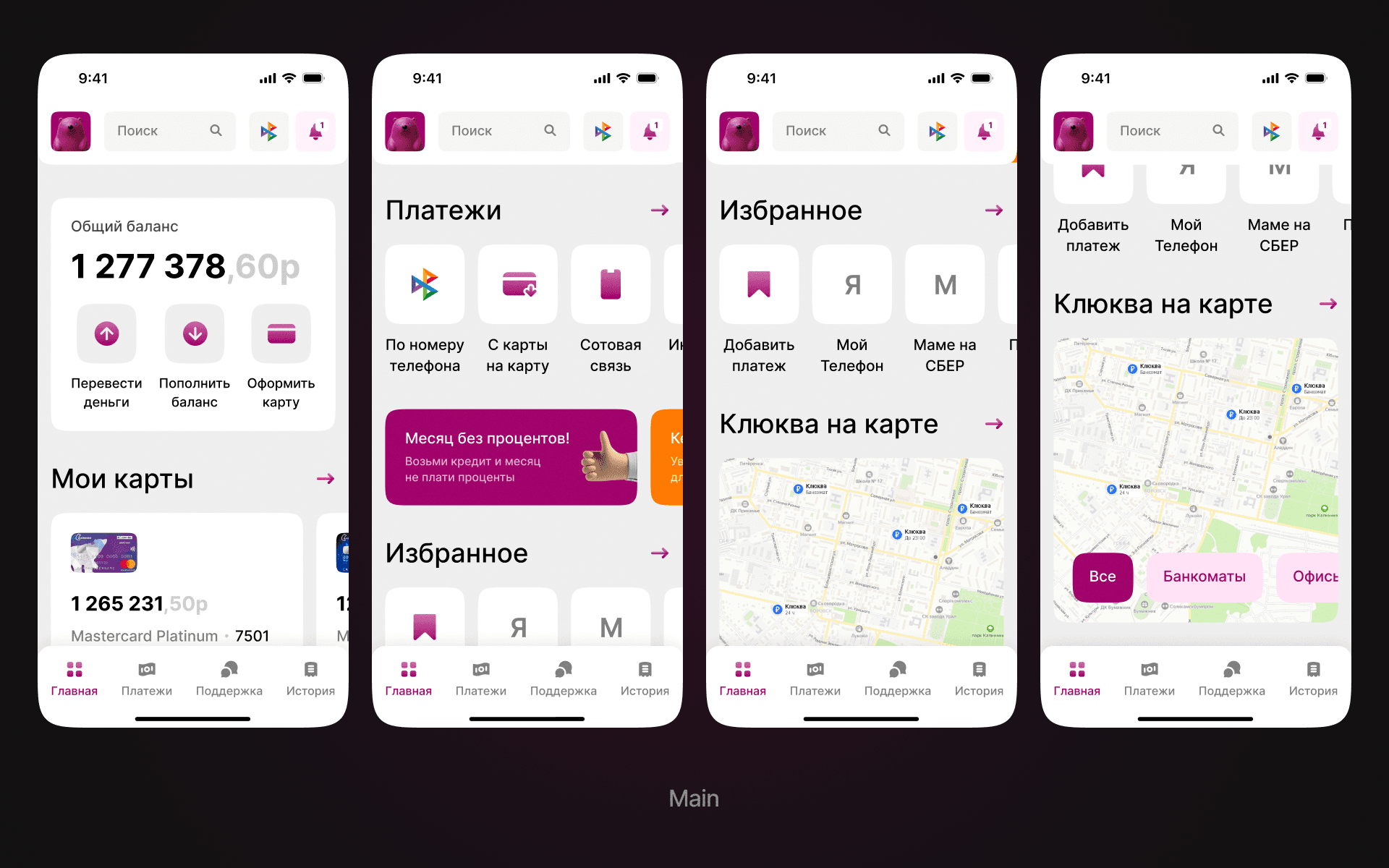
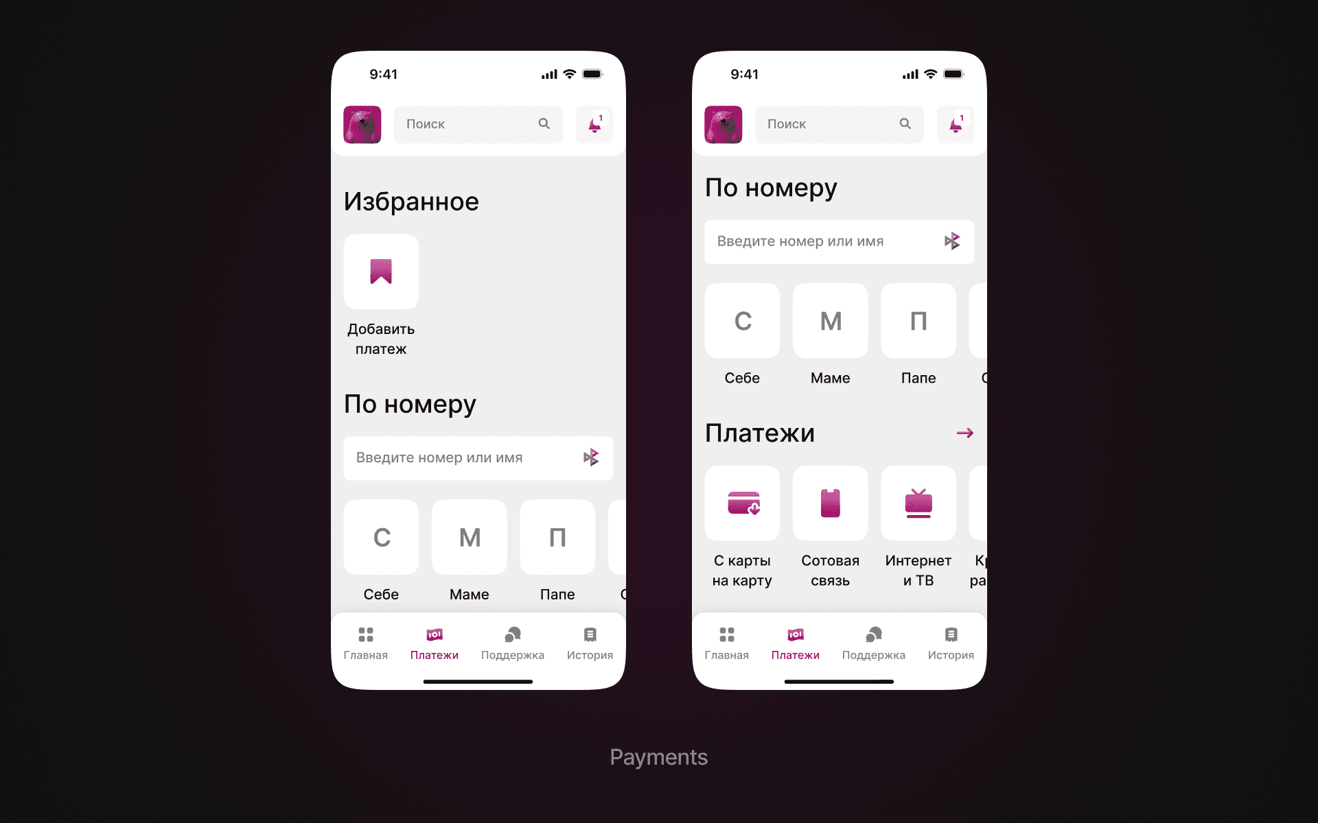
Designed new navigation and core flows.
Achievements
Showed the final concept to the same 4 respondents — informally, no structured test. The reaction was positive: people called the interface clean, clear, easy to navigate. That confirms the core navigation issues were addressed, but it's not a quantitative result.
Outcome
Designed clearer navigation, a transfer redesign with favorites and quick actions, improved history categories, and chat/notification handling — all grounded in real CustDev, with feedback from the same respondents at the final stage.